Velocity vs. GitPrime vs. DIY: How to Choose an Engineering Intelligence Tool
On an engineering team, scaling compromises visibility:
- More code introduces complexity, making problems difficult to diagnose.
- More people makes it harder to spot who’s stuck or who’s overworked.
- More projects make it harder to gather all the information to understand how efficiently your team is working, compared to last sprint or last quarter.
You inevitably lose touch with what’s going on, but you’re still expected to make decisions that boost productivity, improve engagement, and deliver business value. You need a new system to gain back transparency into how your growing team works.
At this point, you might be considering an Engineering Intelligence tool like Velocity or GitPrime to gain back transparency into your people and processes. You likely get the gist of what these tools can do – but how do you choose which approach to analytics works best for your team?
To help you make a decision, we put together a thorough head-to-head comparison of your three most popular options: Velocity, GitPrime, and building your own solution (DIY). Read the post through, or click on a link to skip to the section that’s most important to you.
Setting Up
Data Sources
Tracking Progress
Surfacing Issues
Customization
Cost
Setting Up
Tl;dr: The setup process can be just as fast for both, GitPrime and Velocity, so you can be up and running in as soon as your data imports. Building your own solution will take much more time.
First, you’ll want to know the time and effort it takes to get set up, so you can have an accurate expectation of how soon you’ll be up and running. Both analytics tools recognize the friction involved with process changes, so they’ve done their best to streamline this experience.
Velocity
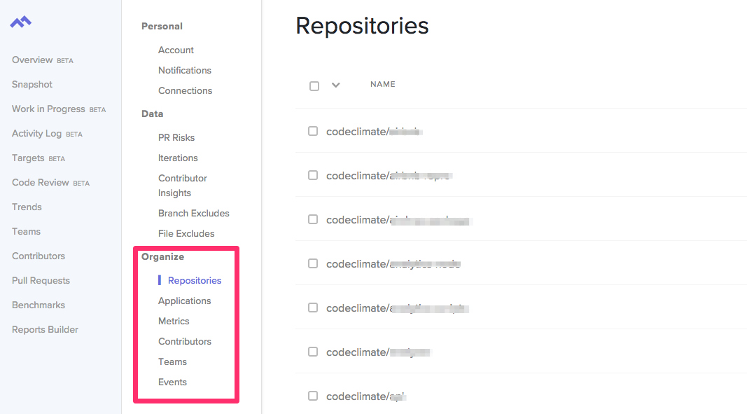
Start setting up Velocity by first signing in with your GitHub or Bitbucket account. Once you’re in, you’ll be prompted to add your repositories, so you can start seeing your engineering data in the app.
GitPrime
GitPrime has a similar setup process. You start by creating a new GitPrime account and then setting up integrations with whichever Git or product management tools you might be using.
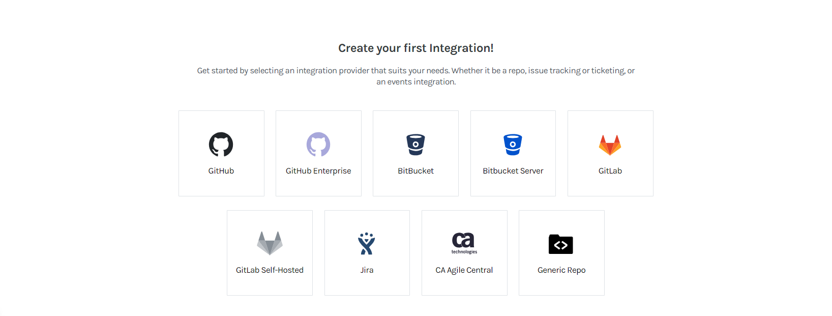
GitPrime supports more version control systems than Velocity, and each has a slightly different workflow. You can import repos accessible over HTTPS or SSH from any server, or use OAuth to connect to your GitHub, GitLab, or Bitbucket organization.
From there, you’ll also have to organize your data. You won’t be able to assign repos to applications, but you organize them by tag. Contributors can similarly be hidden from reports, merged or assigned to teams.
DIY
The setup time for building your own engineering analytics system will depend on how robust of a system you’re building (see recommendations in subsequent sections). Regardless, it’ll be considerably longer than either out-of-the-box analytics tools.
Data Sources
Tl;dr: GitPrime and Velocity both make use of the same breadth of data, but the distinction lies in the additional synthetic metrics available for deeper insights. When you build your own solution, you naturally will have difficulty implementing quite as many sources.
You want transparency into as much of your data as possible. If there are significant gaps in your analytics tool, you’ll be making decisions based on incomplete information (just like before). Both analytics tools prioritize different data sources, which come with distinct advantages and disadvantages.
Velocity
Velocity began with a focus on pull requests, so Velocity imports data from both Git and Git applications like GitHub and Bitbucket. Code-level data and collaborative work data (e.g., PRs + their metadata and review data) are used to put both high-level, and nitty-gritty insights at your fingertips. You can see how your team’s efficiency is increasing week over week, find a particularly pesky PR that is slowing down your team, or see how much time a team member is spending writing new code vs. refactoring.
Velocity also includes data-enrichment algorithms that provide more advanced metrics than purely activity counts and averages. Some examples include:
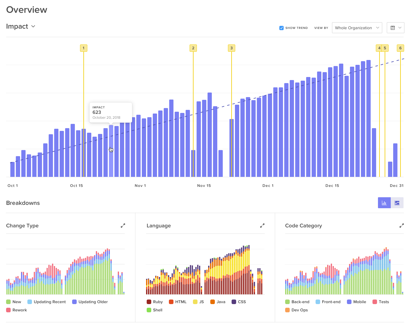
- Impact: This metric reports the estimated difficulty of a change to the codebase, and thus, the impact a given change has on a project. Three variables are factored into this metric: the location of the change, the size, and the nature (e.g., is it a simple re-name of a variable or is it a more complex change).
- Rework: This helps illuminate the quality of the code that your team is producing. This metric is affected when a contributor reworks code that they, themselves have written. High rework can indicate that an engineer is stuck– possibly due to lack of familiarity with the codebase or changing requirements.
- Pull Request Activity Level: This metric estimates how much of your team’s attention a particular pull request is taking up. The number of comments, review cycles, and contributors influences how “active” a PR is. A dashboard that displays PRs by activity level gives a manager insight into which work is most “at risk” of holding up the team.

- Review Cycles: This metric calculates the number of times a PR goes back and forth between the contributor and the reviewer. The higher this count, the more problematic or complex a PR may be.
GitPrime
GitPrime originally imported data from Git, alone, which means their tool primarily works off of source-code level data, not collaborative work data. This enabled them to integrate with more tools (GitHub, Bitbucket, GitLab, etc.), but limited the insights they could provide into collaborative practices such as code review. They’ve recently launched an additional collaborative package that looks at this data but is not fully integrated into all the reports.
Similar to Velocity, GitPrime has their own set of analytics computed by their proprietary algorithm:
- Impact: GitPrime also measures the difficulty of a change to the codebase. According to their docs, their algorithm is based on insertion points, lines of code, and number of files change.
- Churn: This metric measures how much code has been reworked. This number is affected when any contributor refactors any chunk of code and can represent wasted effort.
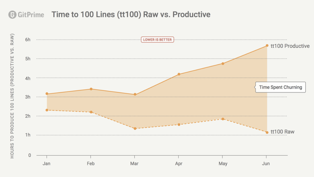
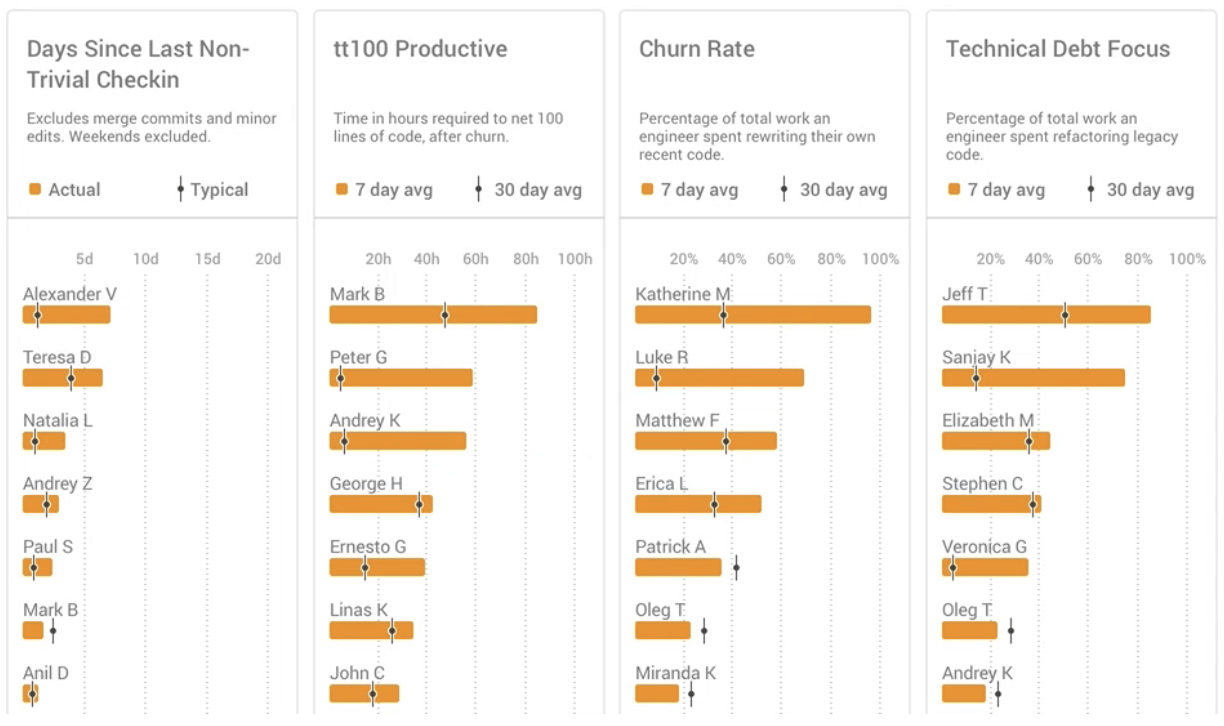
- TT100 Raw: This is the time it takes any engineer to produce 100 lines of code, regardless of the quality of that code.
- TT100 Productive: The time it takes for an engineer to produce 100 lines of code, after churn. This metric represents speed and quality, and GitPrime recommends that managers look at this metric together with TT100 Raw.
DIY
When you build your own solution, you’ll have access to any bit of data made public through Git’s, GitHub’s, or Bitbucket’s API. Git is open source, and neither companies have exclusive partnerships with GitHub or Bitbucket.
You won’t, however, have any access to the proprietary metrics or industry benchmarks that both tools are able to offer based on what they’ve learned from working with 1,000s of engineers.
Tracking Progress
Tl;dr: Both tools provide at-a-glance dashboards that let you see trends over weeks, months or quarters. Velocity provides more PR-related metrics and has a real-time view into how you’re doing this sprint. GitPrime has more contributor-based metrics.
The same insights that previously required hours of digging through repos and countless 1:1s are available at-a-glance in both analytics tools. But different teams define “progress” differently, and thus, so do the makers of analytics tools.
Velocity
Velocity has three main features that allow for progress tracking:
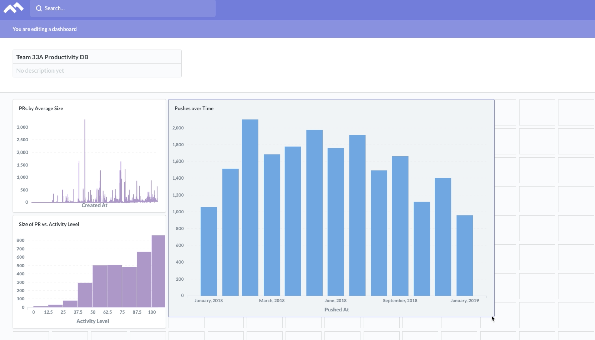
- Overview: This is the home dashboard and summarize the progress your team has made over time, based on metrics like Impact, PRs Merged, or Push Volume. This high-level overview lets you see whether engineering productivity is trending up or down over a given period.
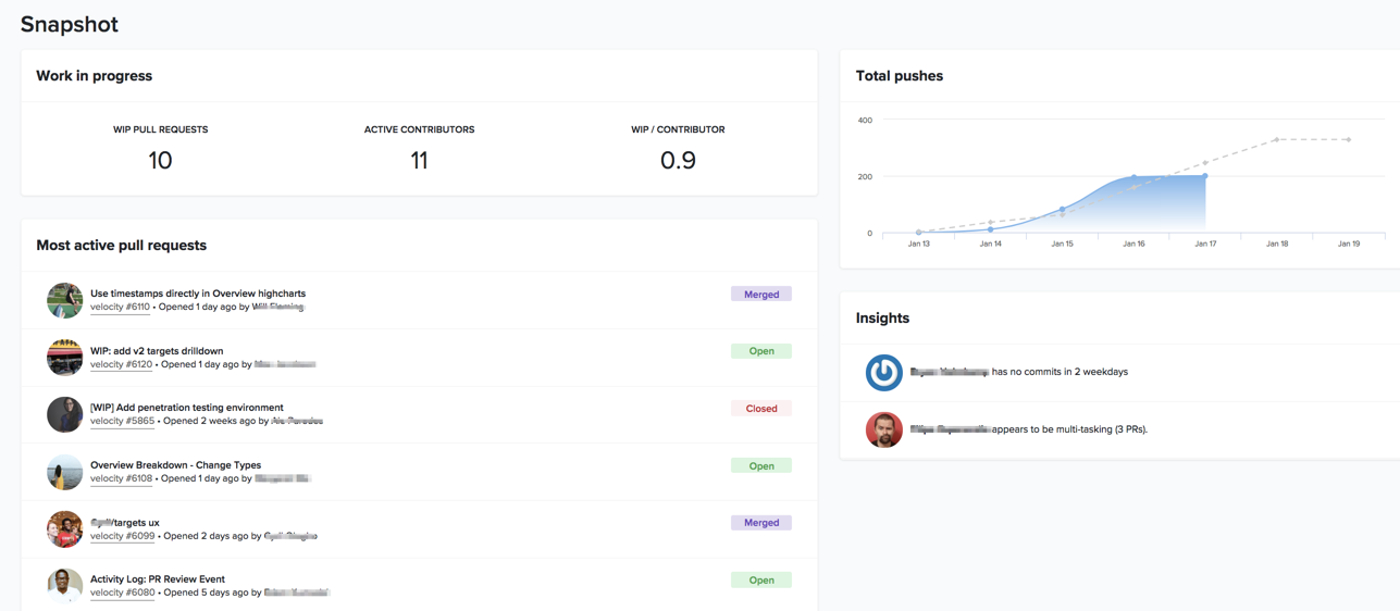
- Snapshot: While most dashboards give insight into trends after-the-fact, the iteration snapshot is a real-time look into the current iteration that your team is working on. You can see workload distribution through the WIP/contributor count, total pushes this iteration as they compare to the previous three, and PR requests ordered by activity level.
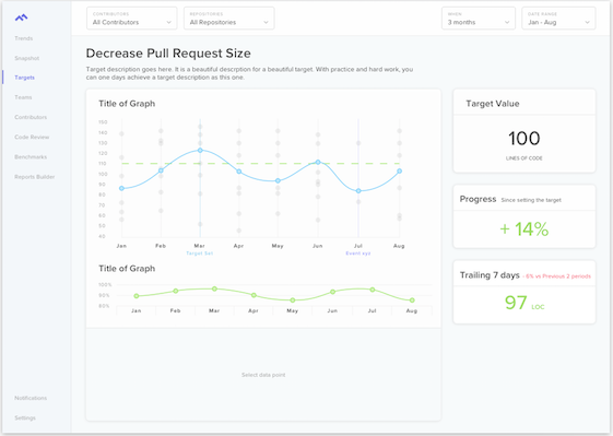
- Targets: The targets page let you take what you’ve discussed in your retros and 1:1s, and set clear goals for improvement. This lets your team rally around shared, metric-based objectives.
GitPrime
GitPrime has its own set of reports for progress tracking:
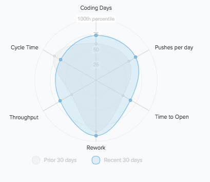
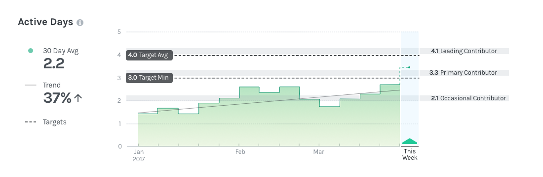
- Fundamentals: The core of GitPrime’s product are four fundamental metrics that they assert are signals of productivity: Active Days, Commits per Day, Impact and Efficiency. They offer dashboards that show the 30-day average, industry benchmarks, and custom targets you can set.
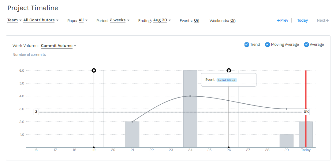
- Project Timeline: This dashboard is similar to Velocity’s Overview dashboard, reporting work progress over time in terms of Impact, Commit Volume, Impact, and Velocity. The subtle difference is that instead of including a PR-related metrics, like Velocity’s PRs Merged, they look at Velocity, which they measure by number of valuable commits per person.
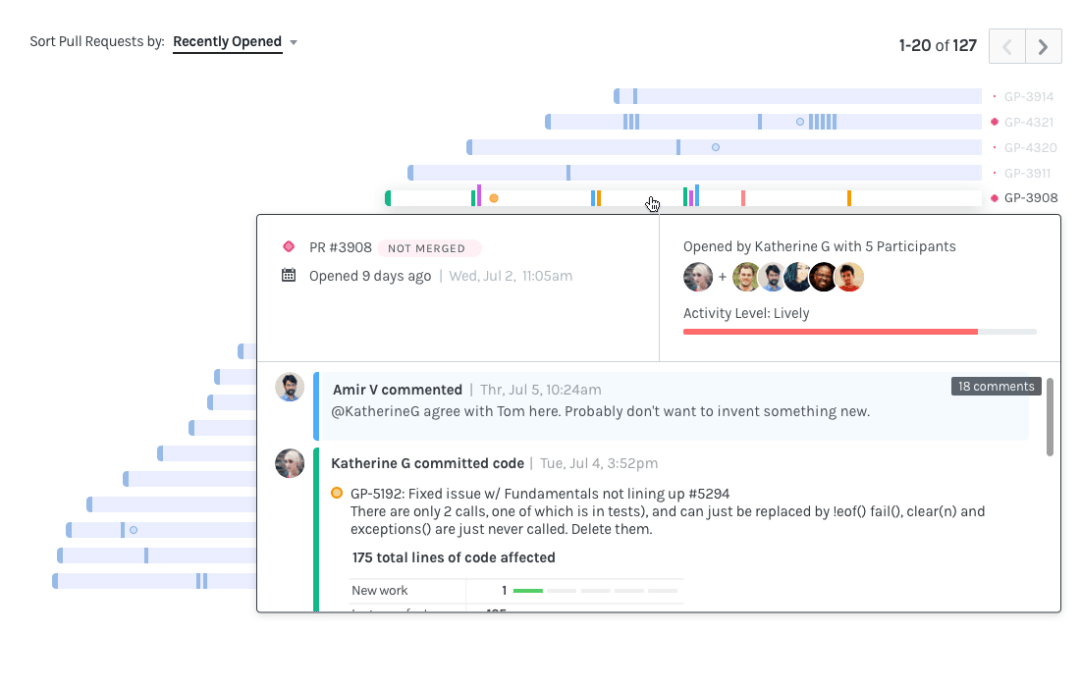
- Review Workflow: (Only available in a higher pricing tier) This is a dashboard that displays all the pull requests over the past two weeks. At a glance, you can see when they were opened and closed, how many comments and changes took place, and whether or not they were reviewed. Clicking on an item shows specific PR details.
DIY
The hardest part of building your own dashboards is deciding what to track. The companies behind these analytics tools pick metrics based on their analyses of thousands of codebases, so deciding which metric represents productivity is difficult for a single team.
The most bare-bones approach is going with the stats that Git provides using line-level commits:
- Additions and deletions in lines of code
- Commit volume
- PRs merged
Checking and recording these on a daily, weekly, or monthly basis will already give you more long-term visibility than what you’re getting from standups and stories.
If you want to track a different metric, you can export your Git log into an Excel spreadsheet and manipulate the data using basic Excel functions. You can visualize trends over time using Excel’s charts and Pivot tables, and hook it up to Zapier to have the spreadsheet automatically update every time there’s a change in Git.
Surfacing Issues
Tl;dr: This is the category in which the two analytics tools differ most. Velocity, with PR-related metrics at the core of the product, does a better job drawing attention (inside and outside of the app) to actual artifacts of work that could be stuck or problematic. GitPrime, with mostly people-focused metrics, draws attention to contributors who could be stuck or problematic.
Engineering is expected to continuously deliver business value to your organization, but a single bottleneck can hold up the entire team during any given sprint. The larger your team gets, the harder it becomes for you to discern what work is stuck in the pipeline and why.
Velocity and GitPrime take different approaches to identifying outliers or irregular work patterns.
Velocity
Velocity employs a variety of visualizations to help you find the root cause of any issue that might slow down your team:
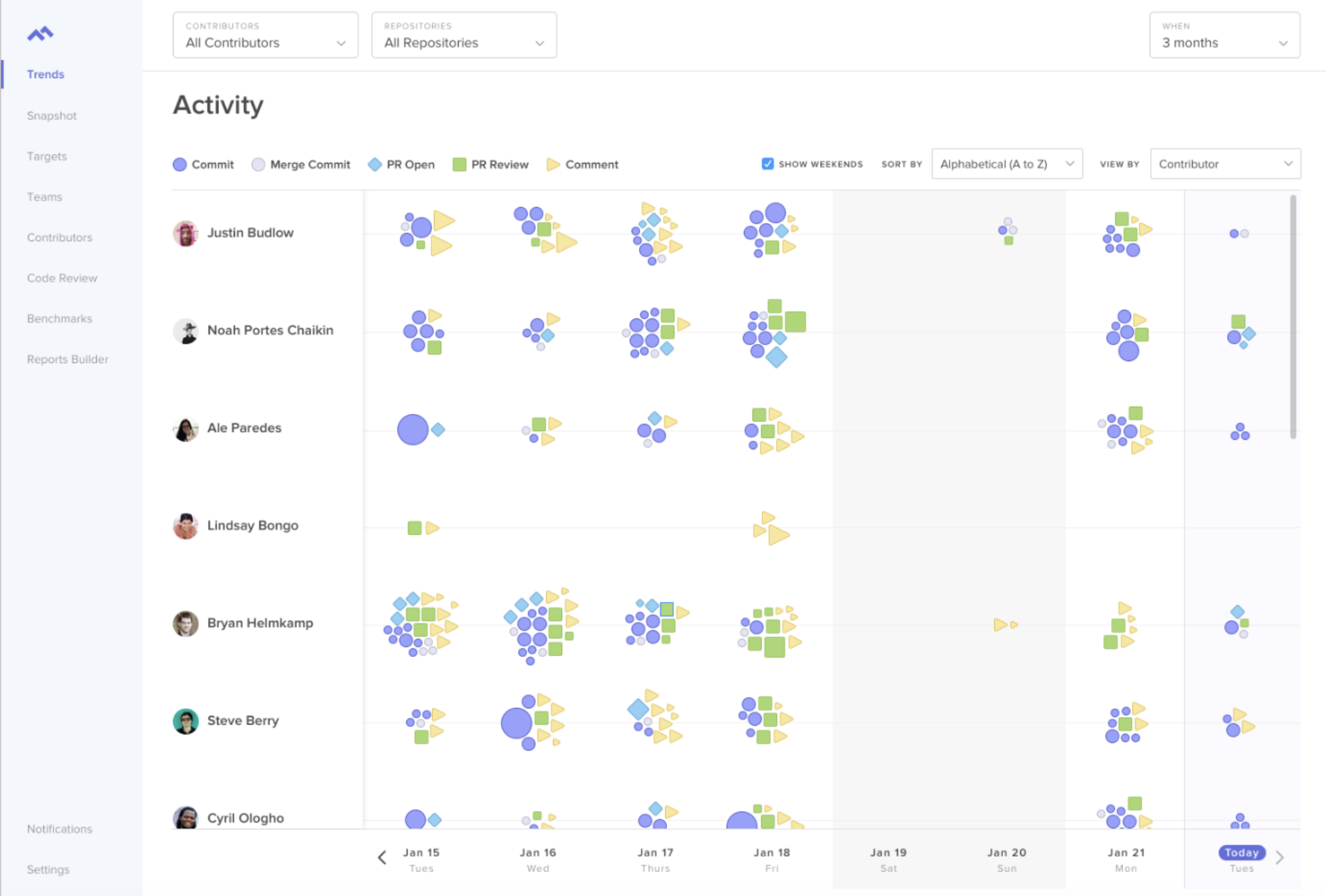
- Activity Log: This report displays the number and size of commits, merge commits, and PRs on a developer-by-developer or team-by-team basis over time. Scanning this page will enable you to see whether what developers are working on meets your expectations.
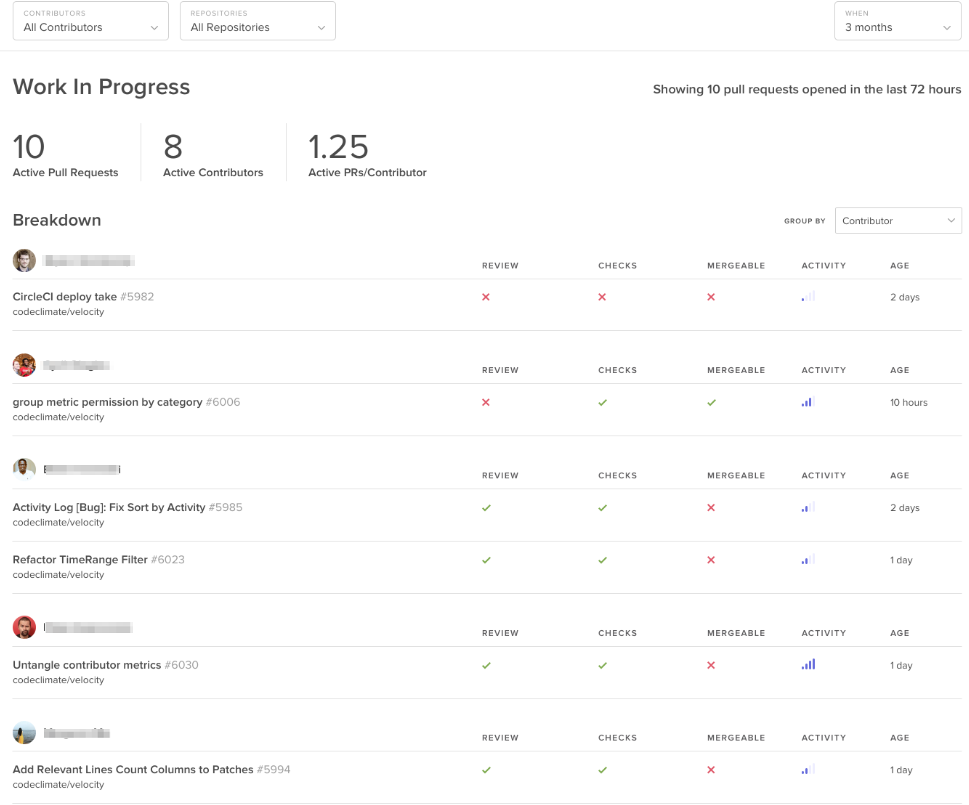
- Work In Progress: This view keeps the WIP/contributor on top, but also shows you how far along each PR is from being merged. You can see at-a-glance which PRs are at-risk and who’s working on them. Click on an item to navigate to the original pull request in GitHub.
Your team is also able to spot issues outside the application through daily standup reports, available via email or Slack. Velocity, thus, isn’t an analytics tool for top-down management but for the whole team to stay on track.
GitPrime
GitPrime’s core product ties each issue to a contributor, which gives managers an easy way to determine who to go to when something goes wrong on a particular week or month. Only in the collaboration reports, available in higher tiers, is there insight into problematic work products, such as PRs.
Here’s where you’d look to find inefficiencies, bottlenecks, and stuck engineers:
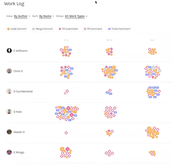
- Work Log: The work log is the application’s homepage. Similar to Velocity’s Activity Log, this page displays different types of work that a contributor produces. In addition to commits, merges, and PRs, they also display ticket comments, since GitPrime also offers an integration with JIRA.
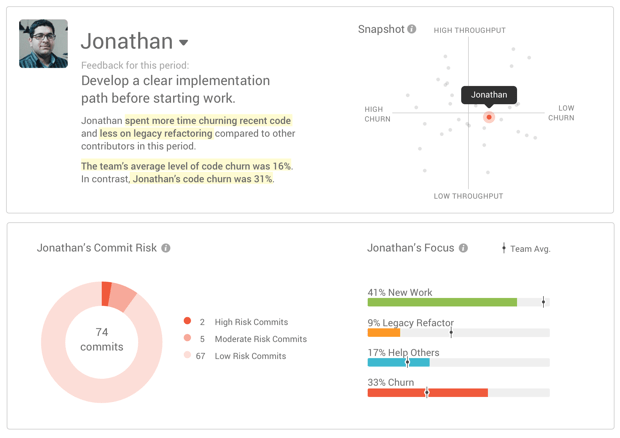
- Snapshot: This feature is basically an automated performance review of each contributor. It gives a summary of how their performance stacks up against their team members’, and plots them on a matrix that shows the speed (measured by Impact) and the quality (measured by Churn) of their work. A further breakdown can be seen below.
- Spot Check: This feature displays how contributor performance has increased or decreased as compared to the last week or last month. At-a-glance you can quickly spot abnormalities and know who to approach for more information.
DIY
In addition to line-level commits and setting up an Excel spreadsheet, you can set up a few basic alerts systems to stay aware of what your engineers are working on and where they might be getting stuck.
GitHub for Slack can pipe in all issues, pulls, statuses, commits and deploys. You can use Slack’s command line for quick searches or to get more details on a particular PR. For summaries of your team’s progress, you can use the commit:all function in Slack at any time, or you can set up a GitHub Weekly Summary using IFTTT, where you’ll be notified how about every issue in a given week.
These solutions won’t give you the full picture, but it’s a way to stay aware of the scope of work that your team is dealing with.
Customization
Tl;dr: DIY is the obvious choice if you want precise control over the metrics you look atand how you render your visualizations. Velocity, however, is a close runner up with the recent launch of their Report Builder feature.
As with many analytics platforms, out-of-the-box solutions work for most, but not for all. If you have unique requirements or track a unique metric, you might require a more flexible platform. Here’s how your three options compare.
Velocity
Velocity has an entire new feature set dedicated to making the product more flexible for teams who work off the beaten path:
- Reports Builder: Velocity exposes all of your pull request, code review and commits data for you to create custom reports. You simply pick your data set, determine how you want it summarized (by average, sum, etc.), and then how you’d like it displayed. You can choose from 9 different views, including line graphs, bar graphs, and area graphs.
You can then use a drag-and-drop dashboard builder to order your visualizations however you’d like. Click save and come back to your custom built dashboard at any point.
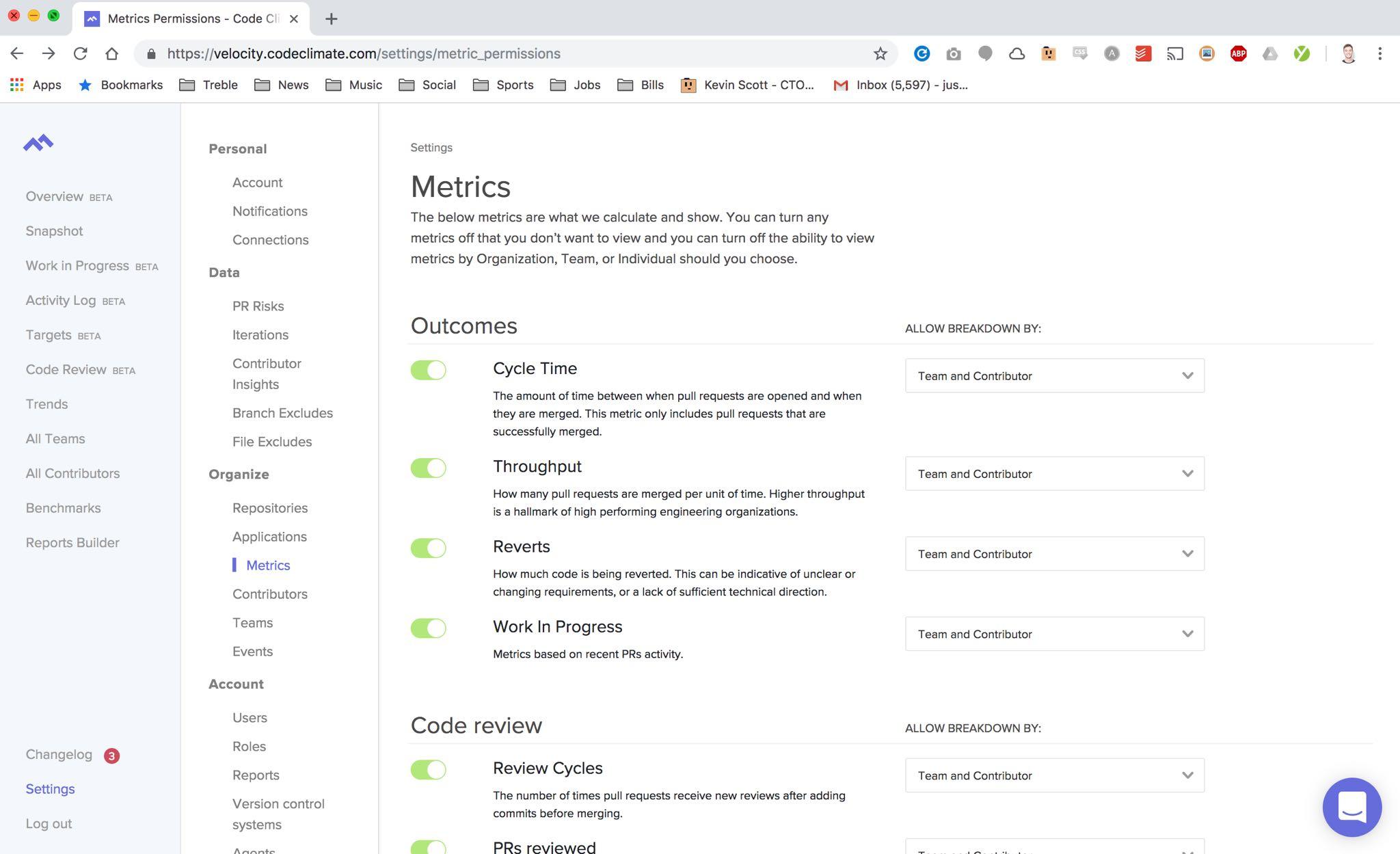
- Reports and Metric Permissions: Not all teams find the same analytics valuable, so Velocity gives users the ability to turn on and off whatever metrics or full features that they’d like. You can also control whether each metric can be segmented by team or individual, or only available at the organization level.
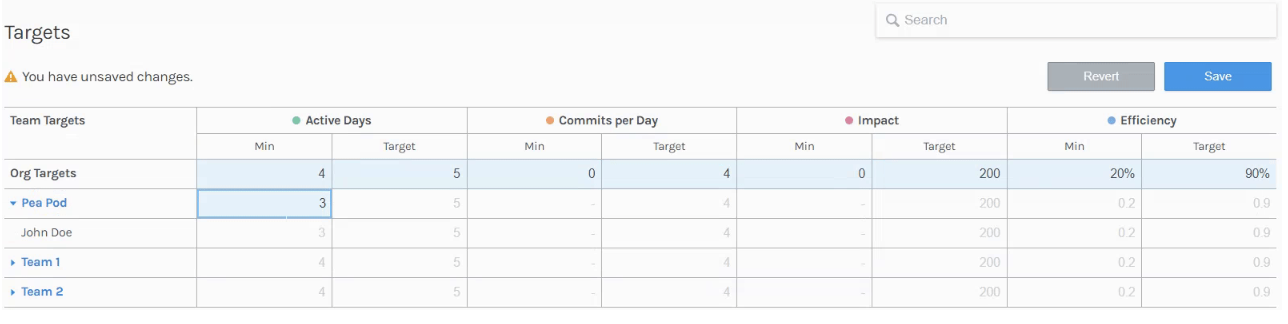
- Contributor-wide, team-wide, or org-wide targets: Once you’re familiar with how your team performs week to week or month to month, you can set targets to push your team to improve along whatever criteria you’re prioritizing. You can attach tags and metadata to these targets, and they’ll be sent out to your team on a weekly basis.
GitPrime
GitPrime does not have custom reporting, but they do offer an API in their Enterprise package for customers who have the resources to build out their own reports.
There is also portion of the application where users can set simple targets for the entire organization, teams, and contributors.
DIY
Building out your own application affords you the most customization. Your only limitation is insight into industry-wide metrics and data-enrichment algorithms.
If you choose to build out a more robust solution, you can build an app that ingests data from GitHub’s API, or hooks into the repos directly, and then render it using a charting library like Highcharts or D3.
Cost
Tl;dr: While pricing of the two products is competitive, GitPrime restricts more features in their lower tiers. Velocity offers more capabilities for less, and the flexibility of their platforms allows for customizability irrespective of cost.
The two products do not differ much in terms of pricing, so if you’re operating within significant budget constraints, a built-it-yourself solution is probably most feasible. Otherwise, both products tier slightly differently, so make sure you’re getting the core features that are most important to your team.
Velocity
Velocity has four pricing packages based on team size, starting at $799. Each tier includes access to all metrics and reports (including the flexible Reports Builder) and gives teams access unlimited historical data.
The small and medium tiers are limited in number of repos (50 and 100, respectively), while the largest priced tier is not. The team reporting function, which lets you see metrics summarized on a team-by-team basis, is not available until the largest tier.
GitPrime
GitPrime has a more complex pricing system. They have 3 tiers with different features, and a sliding pricing scale, based on how many engineers are in your organization. Their pricing starts at $749, but they limit a lot of their features in the lower tiers.
The lowest tier does not include their “code review collaboration insights.” They also restrict the historical data they make available– 12 months for the first tier and 36 months for the second tier.
Different Strokes for Different Management Folks
Velocity has put collaboration at the center of its product, so you’ll have access to more insights into the code review process and into PR-related details right out the gate. Velocity also offers more flexibility, giving you the ability to build any charts that aren’t already available out-of-the-box. Most importantly, Velocity has a few more tools to put your learnings into action. You can set up Slack and email alerts for irregular activity and you have a first-class targets system to encourage your team to improve.
GitPrime, with its focus on individual performance metrics, equips a manager to keep closer track of their engineers, so they have a clear idea of the strongest and weakest performers of the team. This approach is for hands-on managers who still want an active role in how their direct reports work.
If you still haven’t made up your mind, both products offer a two-week trial. Sign up for Velocity’s here.